UHPSI is committed to improving the “triple bottom-line” for those working in the High Plains region. The triple bottom-line extends the fundamental concept of the bottom line, or the profits (or losses) that a business owner might read off the bottom line of a business statement. Securing profits is essential to any successful business, but not to the detriment of the world in which that business operates, or to the detriment of the people linked to that business. UHPSI tries to conduct research that will support management practices that ultimately contribute to people, profit, and planet. A profitable business is nothing if the land on which it depends becomes degraded and lacking in vitality. Similarly, if management practices don’t support the local economy and the livelhoods of people in the region, they are not likely to be adopted.
To better understand the challenges of the region and the foci of our research, we have had to consider (1) environmental health and resiliency (embodied in the “stewardship” portion of our name), as well as (2) economic health and vibrancy, and (3) practices that support community development, agricultural heritage, and local-level quality of life. As researchers, understanding the drivers that influence the ecological and economic bottom lines of region is often more straight forward than understanding the social components. This is particularly the case where most of the UHPSI team members are not from the Western Plains. To better understand what important social factors were at work, and which might be important to address as research progresses, we have explored historical data to provide a clearer picture of change over time.
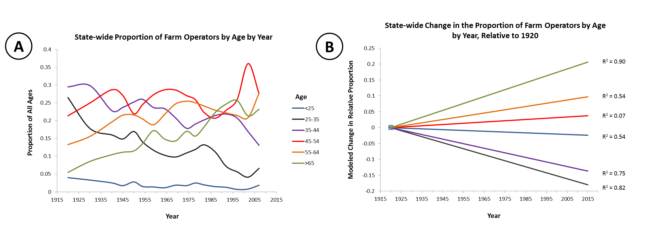
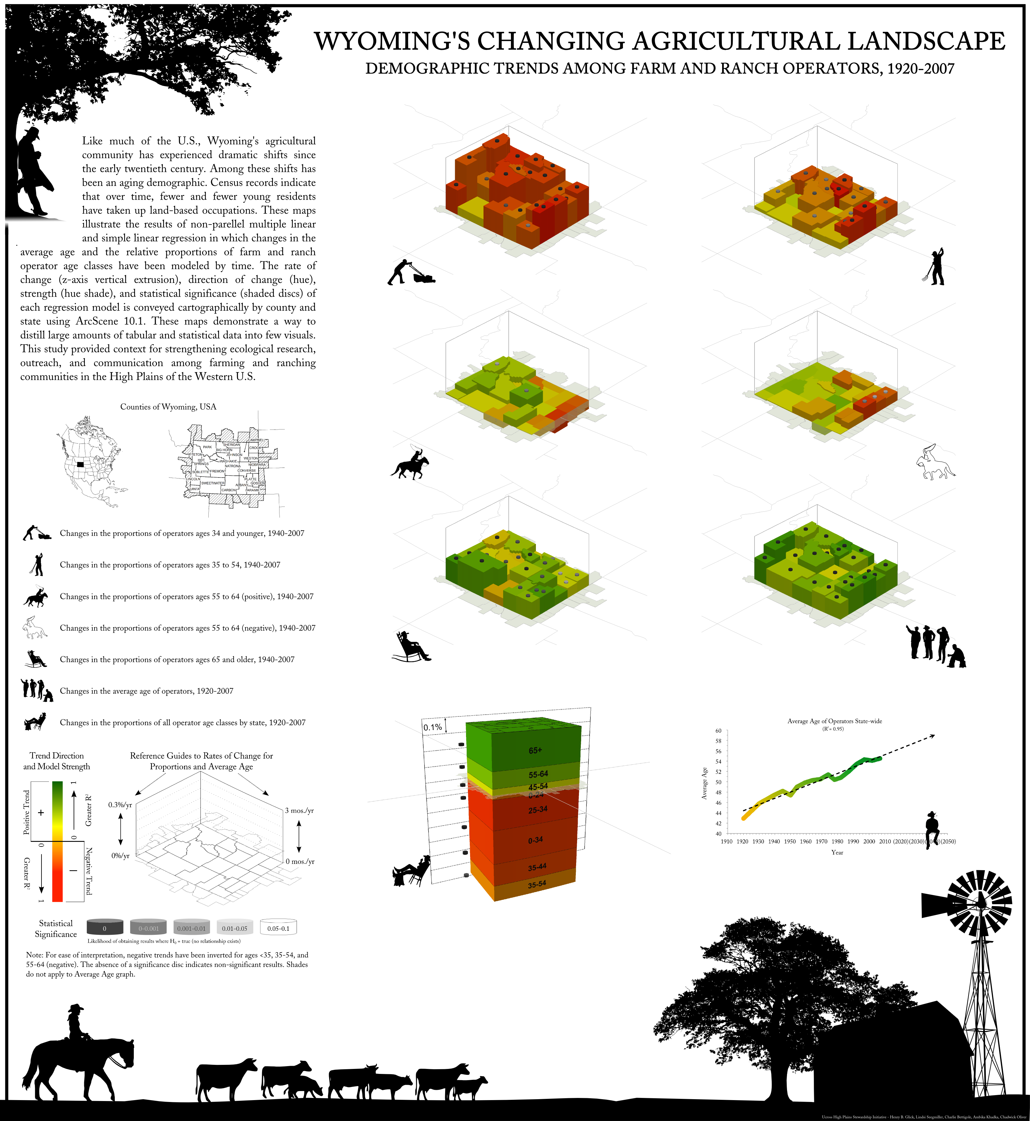
(CLICK image to enlarge) Figure A (left) illustrates the average age for each age class across the entire state. In Figure B (right) the underlying trend for each of those age classes is modeled using linear least-squares regression, with respect to each class’ proportion in 1920. Each regression model can be coarsely evaluated using Pearson’s correlation coefficient (R2, -1 to 1 scale). Where -1 and 1 indicate perfect agreement between variables on the horizontal and vertical axes, we can evaluate the degree to which time explains the variability in proportions. The high R2 for operators 65 and older indicates that a linear regression model is appropriate for this age class, while the low R2 for ages 45-54 suggests that time alone cannot easily predict the proportion of this class. ” width=”830″ height=”283″ class=”size-large wp-image-2005″ /> Figure A (left) illustrates the average age for each age class across the entire state. In Figure B (right) the underlying trend for each of those age classes is modeled using linear least-squares regression, with respect to each class’ proportion in 1920. Each regression model can be coarsely evaluated using Pearson’s correlation coefficient (R2, -1 to 1 scale). Where -1 and 1 indicate perfect agreement between variables on the horizontal and vertical axes, we can evaluate the degree to which time explains the variability in proportions. The high R2 for operators 65 and older indicates that a linear regression model is appropriate for this age class, while the low R2 for ages 45-54 suggests that time alone cannot easily predict the proportion of this class.
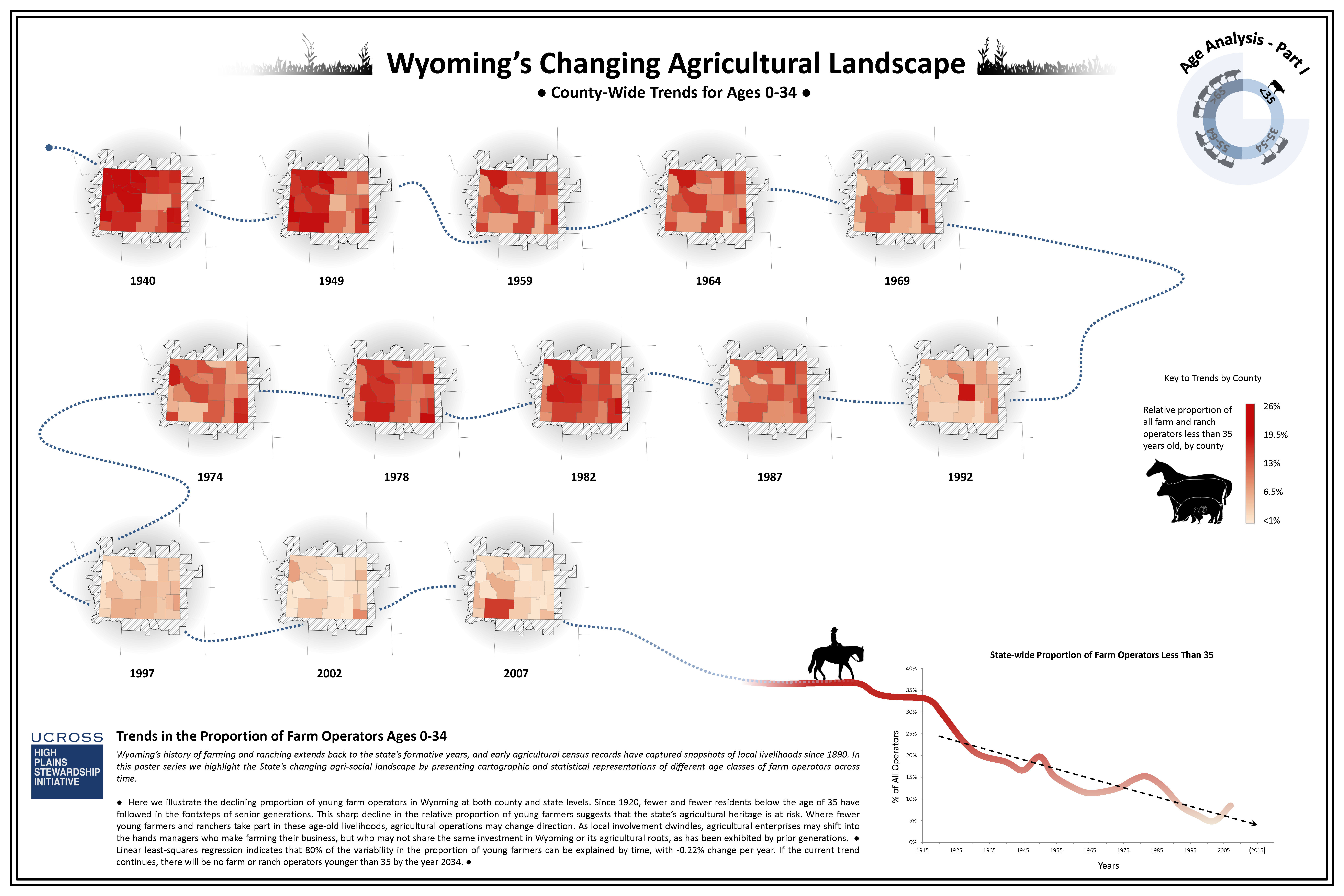
Agricultural census records for the state of Wyoming extend back to the late 1800s. Beginning in the 1920s data was standardized in such a way that statistical analysis brings out patterns and trends that might not otherwise be visible. On a national scale, we have perceived farm and ranch operators to be getting older, and suspected that agricultural management was shifting hands from owner-operators to professional managers. Is this true for Wyoming? It sure is. As the figures on this page indicate, the relative proportion of younger age classes has declined over time, while the proportion of older operators has increased. This is visible at both county and state levels. How do we address these unfortunate trends? There are a variety of avenues that might be taken, but if social action (e.g. community organization), political action (e.g. new legislation), and economic action (e.g. subsidies for new farmers) are not taken to inspire and support Wyoming’s youth in taking up local agricultural occupations, the state’s cultural heritage may become imperiled.
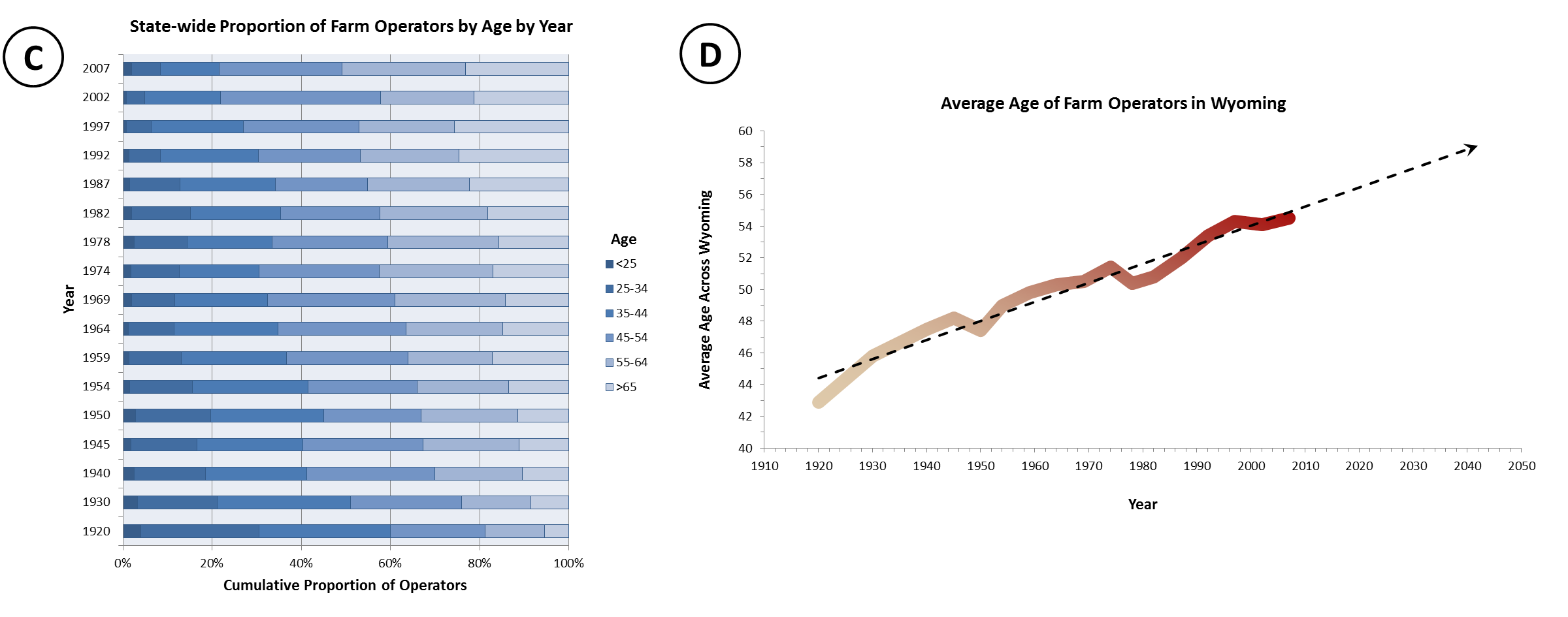
(CLICK image to enlarge) Figure C mimics the information in Figure A, but allows for easy comparison across years. Figure D summarizes all state-wide age statistics, highlighting the rapid increase in age that has come over time. Here, 95% of the variability in age can be explained by time, allowing us to predict into the future with moderate confidence. The average age is increasing at a rate of about a 1.5 months (~44 days) per year, and by 2050 we predict a 35% increase in age over operators from 1920.
Wyoming’s Changing Agricultural Landscape Poster Series
In this series of presentation posters, we evaluate four age classes of farm and ranch operators within each county as far back as the 1940s. Individual age class are presented on the first four posters, while the fifth contains data for state-wide trends.
County-level assessment for ages <35
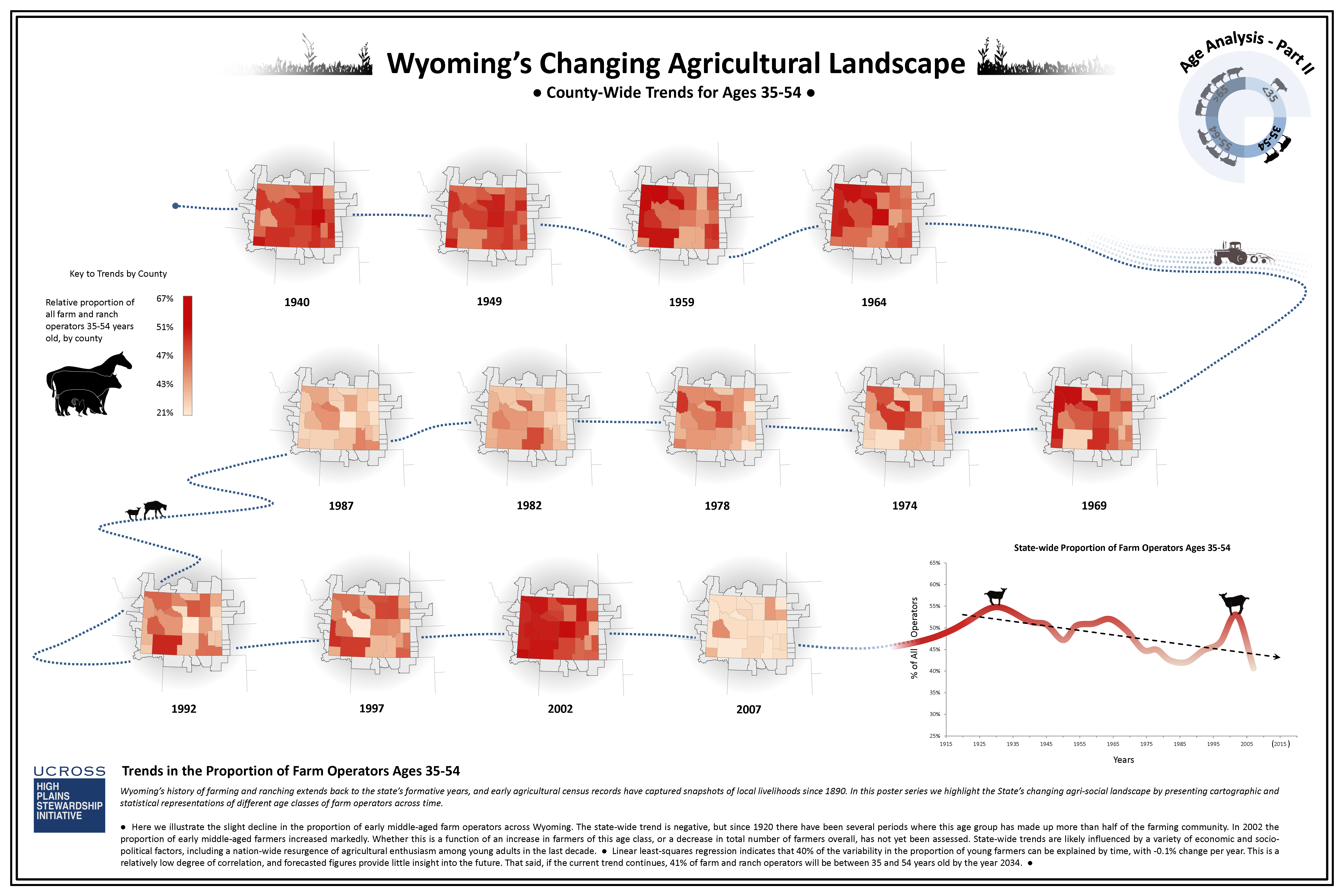
County-level assessment for ages 35-54
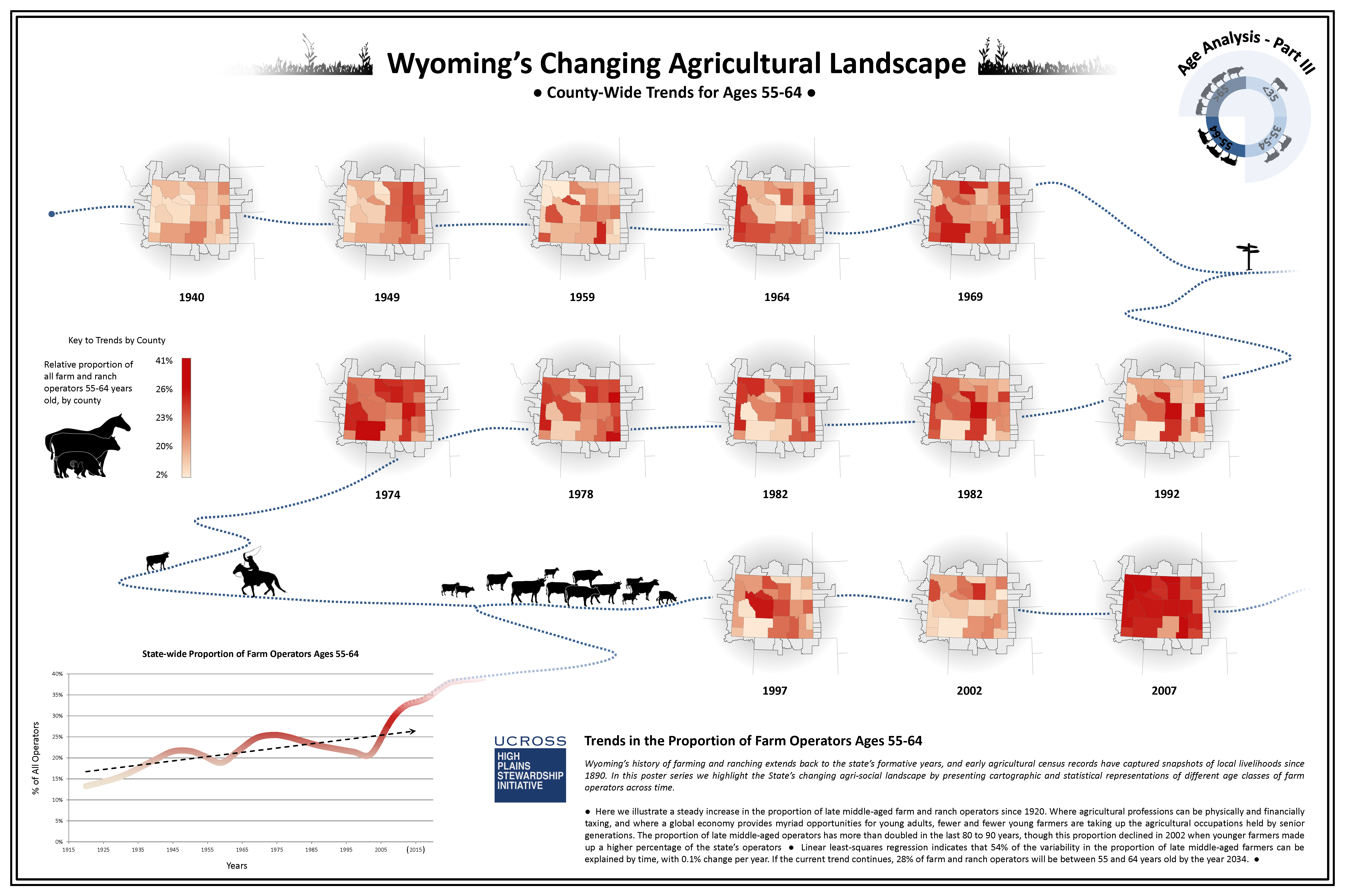
County-level assessment for ages 55-64
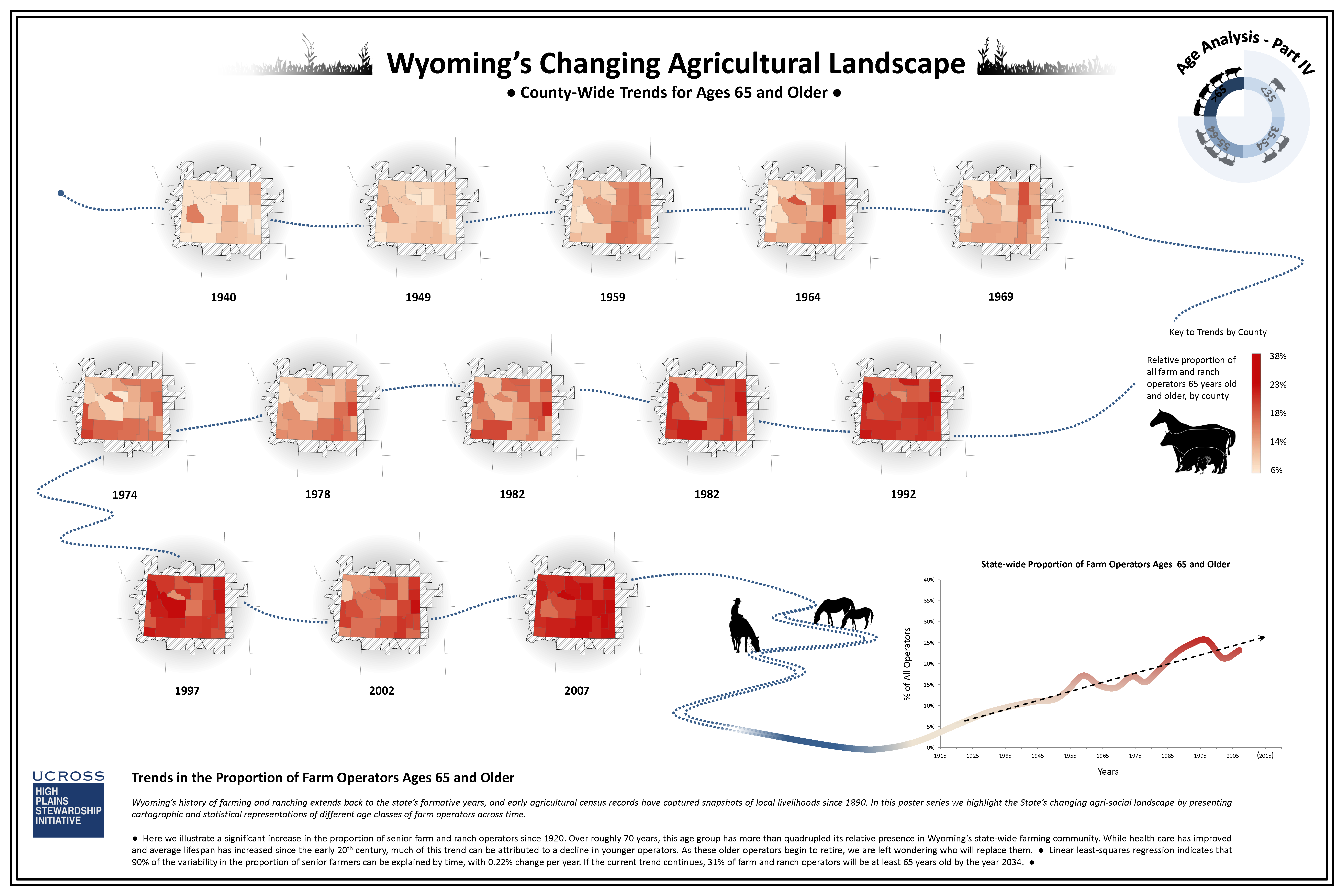
County-level assessment of ages >65
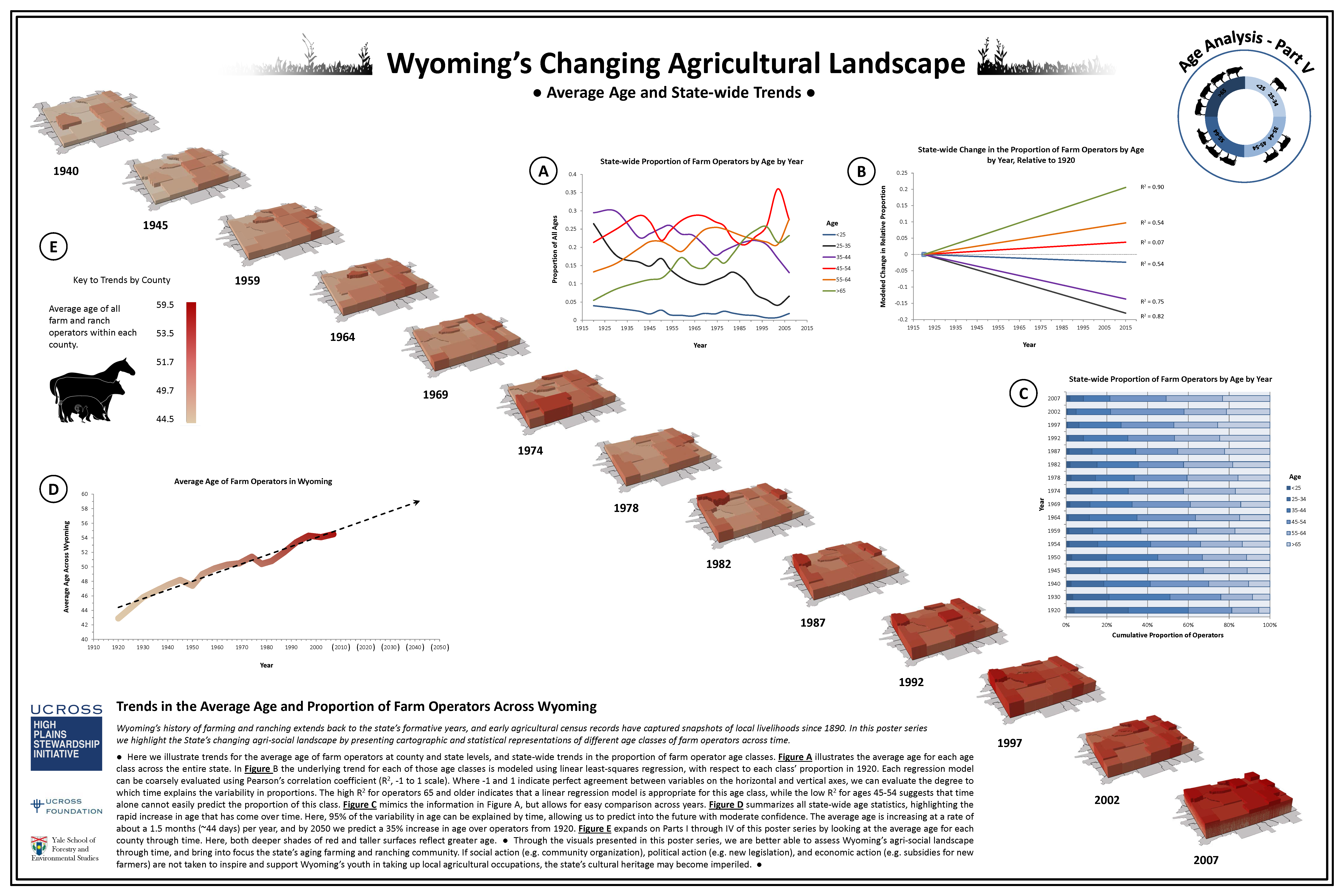
State-level assessment and general trends for all ages
Award winning demographics research presented at the 2014 ESRI User’s Conference
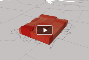
Wyoming’s Changing Agricultural Landscape Video
In this video we illustrate the changes in average age of farm and ranch operators for each county since 1940. You’ll notice that as the average age increases, the colors darken and the height of the county grows.